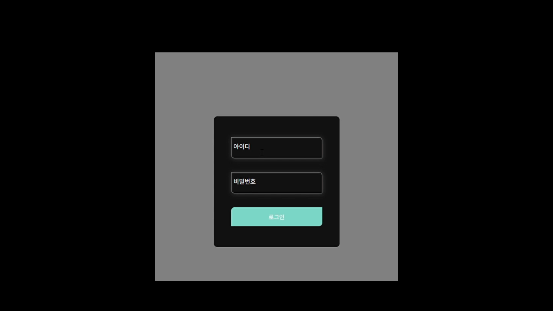
예전에는 저렇게 focus됐을 때 색이 변하는 걸 css로 한 적이 없다. 보통 input을 div로 감싸서 처리해서 거의 다 useState로 처리 했었는데, 이번에 만들어보면서 css 가상클래스를 몇개 배울 수 있어서 좋았다.
1.이번에 사용한 css 가상 클래스
:focus - 해당 요소가 focus(클릭, 입력 등) 됐을 때
:focus-within - 해당요소 혹은 포커스된 요소를 포함하는 요소
:placeholder-shown - placeholder가 보여졌을 때(어떤 입력도 하지 않았을 때)
:not(선택자) - 부정(단일선택자만 가능)
원래는 :has()를 사용해 만드려 했는데, 2023년 말에 도입되기 시작한거라 오래된 브라우저에 작동하지 않아 제외했다.
2.input 컴포넌트와 css
컴포넌트
const Input = ({ children, ...props }) => {
  return (
    <div className="input__wrapper">
      <input {...props} className="input__field " />
      <label htmlFor={props.id} className={`input__label ${props.type}`}>
        {props["data-label"]}
      </label>
      {children}
    </div>
  );
};
export default Input;
label이 input 뒤에있는 이유는 css 결합자로는 앞에 있는 걸 처리 하는게 어렵기 때문에 뒤로 넣는게 맞을 것 같다.
input의 속성을 다 넣기 위해 {...props} 사용
:has()를 사용하지 않기로 하면서 이전과 html구조가 살짝 바뀌었다.
그로 인해서 오류와 만나게 되었는데, input요소는 enclosing tag기 때문에 비어있어야한다는 오류였다.
이 오류는 객체분해를 사용해 children을 맨 앞으로 뺴고 뒤에다가 스프레드 연산자를 사용해 (...props)해서 해결할 수 있었다.
Input 컴포넌트가 모든 타입의 input 요소를 처리하는게 아니기 때문에, 클래스를 다르게 주던가 해야 할듯?
css
.input__wrapper {
  display: flex;
  position: relative;
  padding: 0.5rem 0;
  border: 0.063rem solid gray;
  border-radius: 0 0.5rem 0 0.5rem;
  margin: 1rem 0.5rem;
  box-shadow: 0.063rem 0.063rem 0.625rem rgba(255, 255, 255, 0.2);
  align-items: center;
}
.input__wrapper:focus-within {
  border-color: var(--primary);
}
.input__field {
  border: 0;
  outline: 0;
  color: var(--text);
  padding: 0.5rem;
  padding-right: 2rem;
  background: transparent;
  transition: border-color 0.2s;
  border: 0.125rem;
}
.input__field::placeholder {
  visibility: hidden;
}
.input__field:placeholder-shown + .input__label {
  font-size: 0.875rem;
  cursor: text;
  color: var(--secondary);
}
.input__label {
  position: absolute;
  top: 0;
  left: 0;
  display: block;
  transform: translate(0, 50%);
  color: var(--secondary);
  padding: 0 0.3rem;
}
.input__label,
.input__field:focus + .input__label {
  font-size: 0.75rem;
  transition: 0.3s;
}
.input__field:not(:focus):not(:placeholder-shown) + .input__label,
.input__field:focus + .input__label {
  background-color: var(--background);
  transform: translate(0.2rem, -0.75rem);
}
.input__field:focus + .input__label {
  color: var(--primary);
}
input과 label을 감싸고 있는 .input__wrapper에서 나머지는 꾸미는 용도고 레이아웃이나 그런걸 위해선 아래와 같은 부분이 필수적으로 필요하다.기능이 있는 아이콘을 배치할 필요가 없다면 굳이 display:flex;는 하지 않아도 될 듯 하다.
.input__wrapper{
  display: flex;
  position: relative;
  align-items: center;
  }
:focus-within은 input이 focus될 때 부모 요소의 스타일을 바꿀 때 아주 유용하다.
div.input__wrapper에 감싸져 있는 하위 요소인 input이 focus 됐을 때 input요소의 outline의 색상이 변경되는 것 처럼 div요소의 border 색상을 변경 할 수 있다.
.input__wrapper:focus-within {
  border-color: var(--primary);
}
프리뷰에서 봤듯이 포커스 될 때 보여지는 효과를 주기 위해서 기존의 placeholder를 가리고, label이 아무 것도 입력하고 있지 않았을 때는 placeholder와 같이 보여진다.
이때 label을 나눠서 생각을 해야하는데
input에 아무것도 입력하지 않았을 때/ 그냥 label/ input에 포커스 됐을 때/ input에 포커스도 안됐고 무언가 입력이 되어있을 때
이렇게 나눠서 생각하면 된다.
/* placeholder가리기 */
.input__field::placeholder {
  visibility: hidden;
}
/* input에 아무것도 입력하지 않았을 때의 label*/
.input__field:placeholder-shown + .input__label {
  font-size: 0.875rem;
  cursor: text;
  color: var(--secondary);
}
/* 라벨의 기본 위치는 인풋 안*/
.input__label {
  position: absolute;
  top: 0;
  left: 0;
  display: block;
  transform: translate(0, 50%);
  color: var(--secondary);
  padding: 0 0.3rem;

}
.input__label,
.input__field:focus + .input__label {
  font-size: 0.75rem;
  transition: 0.3s;
}
/*input에 무언가 입력되어있고, 포커스는 안되어있는 상태일 때의 label,
input이 포커스 되어있을 때의 label*/
.input__field:not(:focus):not(:placeholder-shown) + .input__label,
.input__field:focus + .input__label {
  background-color: var(--background);
  transform: translate(0.2rem, -0.75rem);
}
/*input이 포커스 되어있을 때의 label*/
.input__field:focus + .input__label {
  color: var(--primary);
}
참고자료
https://x.com/davidm_ml/status/1882516551838093623
https://developer.mozilla.org/ko/docs/Web/CSS/:focus-within
https://developer.mozilla.org/ko/docs/Web/CSS/:not
https://developer.mozilla.org/ko/docs/Web/CSS/:placeholder-shown